Final Outcome
Overall I am really pleased with the final outcome. I am glad I changed my idea when I did to get a more adult feel to the brand and the concepts. I feel this works much better for the audience I am working towards. I have submitted a range of animation here and I think it gives a good interpretation of what the channel is about and how it feels just from a few short logo blips and some idents. Also I was quite pleased with the menu screen and how this animated and advertised the programming.
I would have liked to have spent longer on the character animation but this was sacrificed by spending longer on the logo animating which I am very pleased about. If I develop this further I will probably redo the character design and rig to a higher standard that I can animate better.
Time Management
This has been a very difficult project for me in terms of balancing my work placement and freelance work with the uni project. As much as I have enjoyed this project it has been very intensive and I haven't had time to devote myself entirely to the work to get a fully comprehensive outcome. I still feel there is a lot more I could have achieved with this project but I am happy with the point I am at now and it definitely stands me in good stead for the ROA exhibition if I choose to use this concept.
Next term I will have full devotion to my projects and I hope to spend longer on the technical aspects of my work rather than the planning and preparation. I would also like to think more about my animating in future and also my rendering could be something I consider to get a more professional look about my work.
Improvements
Like I have said I would definitely like to spend more time animating and rendering in future. I could have improved the finessing of the character animation to a really high standard but again balancing other commitments did not give me the time to do this. In future I will try to plan more time for the later stages of the technical aspects into my production schedule. Overall though I am pleased with the final outcomes I have and I think the strongest thing about this is the brand I have built which I can develop in the future.
Friday, 7 March 2008
Finishing Touches
Obviously I have spent some time animating the logo to get this looking nice as this is the main focus of the branding and the animations. I have also spent time animating my character in the idents. He has formed an integral part of the animation by actually causing the logo to animate in various ways.I think I have worked on this well and this covers the animation side of the brief I was aiming to cover.
In regards to making the animation more dynamic I have asked one of the sound designers to help work on my project by creating some sound for my Pixel logo animating and this is working really well. Alot more time could definitely be spent on this and I could develop this brand in so many more ways if I decide to use it later on for something like ROA.
In regards to making the animation more dynamic I have asked one of the sound designers to help work on my project by creating some sound for my Pixel logo animating and this is working really well. Alot more time could definitely be spent on this and I could develop this brand in so many more ways if I decide to use it later on for something like ROA.
Animating the logo


 Here are some shots of my logo animating up in Maya. I have constructed the logo completely from individual cubes and then worked backwards to have them animating to one point. I think this gives a really nice effect and the sound designer could have some fun with this to get some strange sounds in and emphasise the movement and motion. I have used the same piece of animation here for the idents and 2 of the blips and I think it really represents the brand well and has a good look about it.
Sunday, 24 February 2008
3D Logo Design


These are some shots of the logo I have created in 3D. I have created it entirely from individual pixels which I will animate up to give a focus on the feel of the brand and the meaning of the title PIXEL. Also I think it has a good contrast now it has been integrated with my environment.
Environment Design


This is my new environment I have designed which has a much more urban feel. I think that it suits the audience of the channel alot more than my previous idea. I have also concentrated on texturing the area well to get a good feel and I may work on the lighting further to get a better result in the final renders.
New Storyboards
These are my new ideas for my idents which I have quickly storyboarded up.

The first ident will show the character dropping a single Pixel which he is carrying and placing it on the floor. The Pixel will then evolve into the logo by growing out in all directions as individual cubes. The character will not be the main focus of attention then and it will act more like the BBC Three blob idents where the blobs are very small in comparison to the logo.

The second ident is a bit more exciting whereby the character throws the pixel at a wall and it explodes into more pixels which form the logo.

This is an idea for a blip animation where the logo pixels are scattered and they then jump back to form the logo. I could also reverse this for an alternative blip animation using a different camera angle.

This is a menu animation idea where a pixel from the logo jumps up towards the screen and fills about 2/3 of the screen. The block colour of the pixel then forms a background for the text to be animated on for the channel menu. This will be done in After Effects.
Generally I feel that these ideas are going to work much better and they will be in-keeping with a better channel ethos.
Friday, 22 February 2008
New Character Look
 This is a toned down version of my character which I have decided to use now on my branding. I think he looks a bit more fitting of the audience now rather than something from a children's TV show as he did before.
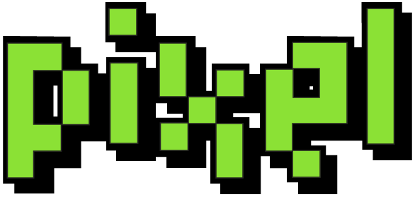
New Logo Design
 This is my new logo design which I think fits in more with the ethos of the brand. The style is better and I feel what I have in mind for the logo animation will also work better. Also I'm using alot of green as the main brand colour to stand out but I also have some darker greens on the character clothing.
Thursday, 21 February 2008
COMPLETE IDEA OVERHAUL
Okay. the deal is I thought long and hard about my idea and realised this is not really working as a branding exercise especially with the narrative I have picked which has little substance for the brand although it could work for a short animated piece. But not in terms of idents and blips however. It is too late to abandon my character designs and I have already put lots of work into this to get to where I am now so I will keep him as a part of the animation. In terms of the environment this will change to something more fitting with my audience. Before the character and the props were seeming to look like a kids TV setup rather than something aimed at design students. With this in mind I am going to create a dingy warehouse with flickering lights as the set and the character will keep the same model but will be retextured to look a little scruffier and more student-like.
The narrative will also be changing to fit in with the structure of the branding better and it will also allow me to expand more. Before I felt there was too much emphasis on the character and not the actual brand itself. I have now decided to make the focus on the logo design and the animation of the logo. I have 2 concepts that will be the main focus. I will storyboard both and choose one. One will be the character completing the logo design by fixing in the final pixel in different ways. The 2nd is to have him dropping a box which represents one pixel and the logo growing and expanding from that one pixel into the larger logo design.
Obviously with this in mind I have also reconsidered my logo design and this will be seen in later posts after this. Also the new concepts allow me to have a better graphical content for the menus and blips which will make the packaging as a whole more aesthetically pleasing.
So my new objectives to complete in the next 3 days include (Until 24th Feb): -
Logo Redesign
New storyboards for idents
Rethink blip ideas and potentially menu screens
Model a warehouse environment
Light and texture environment
Model logo in 3D
Animate 1-2 Idents
Re-texture character
Next week I will be working on the following (25th Feb - 2nd Mar): -
Complete all 3D animations for blips, menus and idents
Render out all work towards the end of the week
Start animating up graphics for menus
Begin thinking about AE work that needs to be applied
And the final week will involve (3rd Mar - 7th Mar): -
Bringing 2D AE graphics together with 3D
Final Renders
Burning work to DVD
FINAL SUBMISSION
Tuesday, 19 February 2008
Re-thinking Ideas

Here is a quick pose I have mocked up to show my character working in my environment. Generally i think the 2 aspects fit together quite nicely.
I have also spent time considering my ideas. I have decided that animating elements in AE aswell as the graphics and the maya animation will detract from the overall look of the branding and really it will overpower it all. I have decided to focus on having some nice Maya work combined with some professional graphics over the top that I will animate in After Effects. This means I may have to change the narrative slightly to make it work better just using the Maya but I think in terms of my time management it will work better just devoting my time to 2 aspects rather than 3 or 4.
Also in terms of finishing the work as a good product I will be using resources on my work placement to complete my work. I will have the sound facilities available to me to get it sounding good with sound effects and jingles and I will also have time to work on it in the graphics department so I have a better, professional and generally more cohesive idea pulled together at the end.
Subscribe to:
Comments (Atom)
