Final Outcome
Overall I am really pleased with the final outcome. I am glad I changed my idea when I did to get a more adult feel to the brand and the concepts. I feel this works much better for the audience I am working towards. I have submitted a range of animation here and I think it gives a good interpretation of what the channel is about and how it feels just from a few short logo blips and some idents. Also I was quite pleased with the menu screen and how this animated and advertised the programming.
I would have liked to have spent longer on the character animation but this was sacrificed by spending longer on the logo animating which I am very pleased about. If I develop this further I will probably redo the character design and rig to a higher standard that I can animate better.
Time Management
This has been a very difficult project for me in terms of balancing my work placement and freelance work with the uni project. As much as I have enjoyed this project it has been very intensive and I haven't had time to devote myself entirely to the work to get a fully comprehensive outcome. I still feel there is a lot more I could have achieved with this project but I am happy with the point I am at now and it definitely stands me in good stead for the ROA exhibition if I choose to use this concept.
Next term I will have full devotion to my projects and I hope to spend longer on the technical aspects of my work rather than the planning and preparation. I would also like to think more about my animating in future and also my rendering could be something I consider to get a more professional look about my work.
Improvements
Like I have said I would definitely like to spend more time animating and rendering in future. I could have improved the finessing of the character animation to a really high standard but again balancing other commitments did not give me the time to do this. In future I will try to plan more time for the later stages of the technical aspects into my production schedule. Overall though I am pleased with the final outcomes I have and I think the strongest thing about this is the brand I have built which I can develop in the future.
Friday, 7 March 2008
Finishing Touches
Obviously I have spent some time animating the logo to get this looking nice as this is the main focus of the branding and the animations. I have also spent time animating my character in the idents. He has formed an integral part of the animation by actually causing the logo to animate in various ways.I think I have worked on this well and this covers the animation side of the brief I was aiming to cover.
In regards to making the animation more dynamic I have asked one of the sound designers to help work on my project by creating some sound for my Pixel logo animating and this is working really well. Alot more time could definitely be spent on this and I could develop this brand in so many more ways if I decide to use it later on for something like ROA.
In regards to making the animation more dynamic I have asked one of the sound designers to help work on my project by creating some sound for my Pixel logo animating and this is working really well. Alot more time could definitely be spent on this and I could develop this brand in so many more ways if I decide to use it later on for something like ROA.
Animating the logo


 Here are some shots of my logo animating up in Maya. I have constructed the logo completely from individual cubes and then worked backwards to have them animating to one point. I think this gives a really nice effect and the sound designer could have some fun with this to get some strange sounds in and emphasise the movement and motion. I have used the same piece of animation here for the idents and 2 of the blips and I think it really represents the brand well and has a good look about it.
Sunday, 24 February 2008
3D Logo Design


These are some shots of the logo I have created in 3D. I have created it entirely from individual pixels which I will animate up to give a focus on the feel of the brand and the meaning of the title PIXEL. Also I think it has a good contrast now it has been integrated with my environment.
Environment Design


This is my new environment I have designed which has a much more urban feel. I think that it suits the audience of the channel alot more than my previous idea. I have also concentrated on texturing the area well to get a good feel and I may work on the lighting further to get a better result in the final renders.
New Storyboards
These are my new ideas for my idents which I have quickly storyboarded up.

The first ident will show the character dropping a single Pixel which he is carrying and placing it on the floor. The Pixel will then evolve into the logo by growing out in all directions as individual cubes. The character will not be the main focus of attention then and it will act more like the BBC Three blob idents where the blobs are very small in comparison to the logo.

The second ident is a bit more exciting whereby the character throws the pixel at a wall and it explodes into more pixels which form the logo.

This is an idea for a blip animation where the logo pixels are scattered and they then jump back to form the logo. I could also reverse this for an alternative blip animation using a different camera angle.

This is a menu animation idea where a pixel from the logo jumps up towards the screen and fills about 2/3 of the screen. The block colour of the pixel then forms a background for the text to be animated on for the channel menu. This will be done in After Effects.
Generally I feel that these ideas are going to work much better and they will be in-keeping with a better channel ethos.
Friday, 22 February 2008
New Character Look
 This is a toned down version of my character which I have decided to use now on my branding. I think he looks a bit more fitting of the audience now rather than something from a children's TV show as he did before.
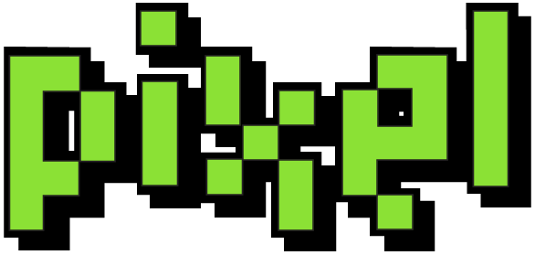
New Logo Design
 This is my new logo design which I think fits in more with the ethos of the brand. The style is better and I feel what I have in mind for the logo animation will also work better. Also I'm using alot of green as the main brand colour to stand out but I also have some darker greens on the character clothing.
Thursday, 21 February 2008
COMPLETE IDEA OVERHAUL
Okay. the deal is I thought long and hard about my idea and realised this is not really working as a branding exercise especially with the narrative I have picked which has little substance for the brand although it could work for a short animated piece. But not in terms of idents and blips however. It is too late to abandon my character designs and I have already put lots of work into this to get to where I am now so I will keep him as a part of the animation. In terms of the environment this will change to something more fitting with my audience. Before the character and the props were seeming to look like a kids TV setup rather than something aimed at design students. With this in mind I am going to create a dingy warehouse with flickering lights as the set and the character will keep the same model but will be retextured to look a little scruffier and more student-like.
The narrative will also be changing to fit in with the structure of the branding better and it will also allow me to expand more. Before I felt there was too much emphasis on the character and not the actual brand itself. I have now decided to make the focus on the logo design and the animation of the logo. I have 2 concepts that will be the main focus. I will storyboard both and choose one. One will be the character completing the logo design by fixing in the final pixel in different ways. The 2nd is to have him dropping a box which represents one pixel and the logo growing and expanding from that one pixel into the larger logo design.
Obviously with this in mind I have also reconsidered my logo design and this will be seen in later posts after this. Also the new concepts allow me to have a better graphical content for the menus and blips which will make the packaging as a whole more aesthetically pleasing.
So my new objectives to complete in the next 3 days include (Until 24th Feb): -
Logo Redesign
New storyboards for idents
Rethink blip ideas and potentially menu screens
Model a warehouse environment
Light and texture environment
Model logo in 3D
Animate 1-2 Idents
Re-texture character
Next week I will be working on the following (25th Feb - 2nd Mar): -
Complete all 3D animations for blips, menus and idents
Render out all work towards the end of the week
Start animating up graphics for menus
Begin thinking about AE work that needs to be applied
And the final week will involve (3rd Mar - 7th Mar): -
Bringing 2D AE graphics together with 3D
Final Renders
Burning work to DVD
FINAL SUBMISSION
Tuesday, 19 February 2008
Re-thinking Ideas

Here is a quick pose I have mocked up to show my character working in my environment. Generally i think the 2 aspects fit together quite nicely.
I have also spent time considering my ideas. I have decided that animating elements in AE aswell as the graphics and the maya animation will detract from the overall look of the branding and really it will overpower it all. I have decided to focus on having some nice Maya work combined with some professional graphics over the top that I will animate in After Effects. This means I may have to change the narrative slightly to make it work better just using the Maya but I think in terms of my time management it will work better just devoting my time to 2 aspects rather than 3 or 4.
Also in terms of finishing the work as a good product I will be using resources on my work placement to complete my work. I will have the sound facilities available to me to get it sounding good with sound effects and jingles and I will also have time to work on it in the graphics department so I have a better, professional and generally more cohesive idea pulled together at the end.
The Environment


 In keeping with the simplicity of my ideas for the branding I have made a very minimalist environment for my character so there is more emphasis on him. The colours of the textures are bold and stick to the brand identity quite well and also of this allows for pure focus on the character and the simplicity of the narrative. Overall I really like the look of this layout. The only thing I may work on more is the lighting so it brings out the character better from all angles that I may end up using.
Monday, 18 February 2008
Rigging the Character
 Rigging has been a very tedious part of the process or this project. Luckily to save time I have taken a rig from a previous project and adapted it to fit this character mesh. Unfortunately I have still had to spend 1-2 days painting the weighting on the character but it seems to be working well now after many hours weighting the rig. Also the blend shapes are working very well in conjunction with the movement of the character and generally I think I will be able to animate this effectively for my final pieces of animation.
Texturing the Character

 Above are a couple of images to show the texturing I have done on my character. I have kept the colours quite blocked out and simple to fit in with the style of the animation I want to portray. Generally all the textures are plain block colours and I have finished him off with finer details on the eye balls and on the t-shirt which shows the PIXEL logo. Generally I like this subtle but vibrant look and I think it will fit the persona of the character.
Thursday, 31 January 2008
Rough Graphics Mock-up
 This is a rough TV Graphic I made up in illustrator to give an idea of the look on the ident. I think I will rethink these ideas and especially the positioning of the etc but I think its a good starting point especially with the use of the space invader graphic and font from the logo. Also I would like to animate these graphics like tetris pieces falling into place as I think this would work really well and obviously with the Pixel idea.
Revised Production Schedule (Weeks 5-9)
Now we are at the half way stage I have decided to set out a clear set of tasks that I will need to keep to for each week. This will mean I come in with the finished product on the deadline.
Week 4 - Character Rig
Week 5 - Character Rig and Texturing Complete, Set Modelling and Props
Week 6 - Ident Animations
Week 7 - Rendering and Pixel imagery, Animate in After Effects
Week 8 - Draw up After Effects Pixel imagery and Animate Up, Draw up graphics and record dialogue.
Week 9 - Sound, Editing, Final Renders and Graphics
If I stick to this schedule I should have no trouble coming in on time. I think I may be able to save some time in Weeks 7 and 8 as this could be a quicker process if my 2D After Effects imagery is made more basic and pixelated. This then may allow for more time to spend on graphics and finishing a nice set of idents.
I will re-assess this production schedule weekly from now on.
Channel Branding Research
As additional background research I have decided to look at different channel brands that in one way or another use a character to brand themselves. The main three I am looking at are BBC 2's robotic 2, Sci Fi's Geekboy and BBC Three's Animated Blobs.

 I like the subtlety on these idents. The robotic characters does comical things which sometimes you dont really expect and the shock of the humour is a good feature for the idents which dont last very long. It entertains the audience for that short period of time effectively.
 The BBC 3 Blobs I think are a better identity than the BBC 2 robot. I generally think this is all people think of when they associate BBC 3. The brand of the blobs is well known and again the quirky animations work well for the short timespan of the idents. I also like the more relaxed and cartoony feel to these.

 The Geekboy idea is probably the most suited to the theme of my brand and I like the way this is done. The styling is not quite what I would go for as I think its a bit wild. I prefer the subtleness of the BBC animations but these are quirky in another form. The animations are very imaginative and extremely cartoony but I think the BBC ones show more character. Definitely this theme is a good starting point for my brand idea but the way in which it is portrayed would not suit me or my audience as I feel it is too 'Trekkie Geek' rather than 'Chic Geek'
All the brands have their strong points and weak points. But the main thing is their strong consistency and brand values that relate to their target audience. I need this kind of strong link to make my brand work for the people seeing the work.

 I like the subtlety on these idents. The robotic characters does comical things which sometimes you dont really expect and the shock of the humour is a good feature for the idents which dont last very long. It entertains the audience for that short period of time effectively.
 The BBC 3 Blobs I think are a better identity than the BBC 2 robot. I generally think this is all people think of when they associate BBC 3. The brand of the blobs is well known and again the quirky animations work well for the short timespan of the idents. I also like the more relaxed and cartoony feel to these.
 The Geekboy idea is probably the most suited to the theme of my brand and I like the way this is done. The styling is not quite what I would go for as I think its a bit wild. I prefer the subtleness of the BBC animations but these are quirky in another form. The animations are very imaginative and extremely cartoony but I think the BBC ones show more character. Definitely this theme is a good starting point for my brand idea but the way in which it is portrayed would not suit me or my audience as I feel it is too 'Trekkie Geek' rather than 'Chic Geek'
All the brands have their strong points and weak points. But the main thing is their strong consistency and brand values that relate to their target audience. I need this kind of strong link to make my brand work for the people seeing the work.
Character Animation - Blend Shapes
 This image shows how I have worked belnd shapes into my character for facial animation. As I am not lip syncing this character I havent got to worry about every single visome or phoneme for the sounds but I have done some basic eyebrow movements and happy and sad and excited looks so I can work some good expressions into the animations and show some good emotion.
To do this I have basically made duplicates of the head model and then altered the duplicates to different shapes. Maya then creates blend shapes between the base and the duplicate to give me a slider which can be altered at different levels to change the degree of animation. Also I can mix individual movements together to create new ones.
Character Modelling / Texturing
Here are some image screenshots from Maya of my character modelling. I have developed this design from my Illustrator drawing from earlier on. I have used polys to create my model. Basically I blocked out the shapes and then mirrored the geometry. I then smoothed the model to get a better finish and remove the obvious 'blockyness'.

I have also started to experiment with some basic textures to see what I like. I have played with the idea of toon shading and maybe giving my character a toy like look with very plasticy textures. This could keep in with the idea of retro and geekyness and geeky toys!


I have also started to experiment with some basic textures to see what I like. I have played with the idea of toon shading and maybe giving my character a toy like look with very plasticy textures. This could keep in with the idea of retro and geekyness and geeky toys!


Sunday, 27 January 2008
Ident Storyboards
Here I have started to storyboard up some ideas for my idents. The three main ideas I am going to work on are a Medieval game, a Ninja game and a Zombie game. These are some rough storyboards for each along with a basic description of the narrative.

In this ident the Geek is playing a Medieval Game. In the game he is faced with a dragon and the dragon kills the player. Flames then shoot out of the screen and scorch the Geek to charcoal! The Geek then moves slightly in charcoal form as the graphics are overlaid.

In this ident the Geek is playing a Ninja game. The Geek is defeated by the Ninja enemies in the game and then Ninja throwing stars come out of the screen and pin him to the couch so he cannot move. As the graphics are overlaid he tries to squirm free.

In this ident the Geek is playing a Zombie game. After killing a few enemies the Geek is attacked and killed by an angry pack of Zombies. The shot then returns to the Geek on the sofa. He is passed out and 'zombified' and he gets up and walks like a zombie with his slightly severed head as the graphics are overlaid.
I think these are 3 good idents that stick to a similar format and layout and style so that they all look generic and part of the same brand. It will show continuity and people will be able to identify the brand on each individual ident.
Wednesday, 23 January 2008
Ident Ideas
I have had several ideas about my Pixel idents. The main one I started
with was thinking about my Geek character doing generally 'geeky'
things such as reading comics, playing computer games or making models.
I then thought about this idea more thoroughly and considered having
the Geek character in a plainer environment to emphasise the animation.
Then I started to think about the title of Pixel and how I could
stylise a pixelated animation. However I have already started
developing a 3D model which i think will work well.
My idea now is to have my Geek character in 3D playing computer games. The idents will
then show the computer game to look like a Megadrive style game and the
Geek character in a different game situation. The ident will then cut
back to show a reaction to the game that has been inflicted upon the
character. For example: The Geek will be playing a medieval game where
he fights a dragon, the dragon will scorch him with flames and the 3D
character will then be sitting playing the console but will b still and
'chargrilled' due to the dragon's flames. This will tie the pixel
themes together and then solid 3D animation.
Here are some videos I have found for inspiration for the pixel look: -
Going for a style like this I think will reflect the ethos of my brand whilst still focusing on 2 good styles of animation. Whilst the 3D will be powerful I think this will demonstrate the different styles of animation that can be considered.
Thursday, 17 January 2008
Character Design
I have started work on a character design for Pixel. The initial idea was to have a Geek character to represent the channel. Below is a rough sketch I came up with which I quite liked.

I then used the sketch to work on a cleaner design which I did in Illustrator.

After doing the Illustrator version I actually quite like the attributes of the character and I think the cartoony look has quite a good appeal. Once I have made my character in 3D I may consider using cel rendering to get an alternative effect as I think this could stylize the pieces of animation quite nicely.
Monday, 14 January 2008
Pixel Art Research and Inspirations


 My initial thoughts about the pixel idea drew me straight to retro games and I thought immediately of using the iconic Space Invader character! I thought this could be a really good icon for the logo that represents the title and the geeky side of animators. The plus side is that retro gaming is more of a culture now and often travels with the more 'Chic Geek' culture of the 21st Century!
 Also I considered pixel designs for my character but I think this would be more successful and easier to animate in 3D. I could however incorporate some pixel art designs into my 3D environments to continue some themes.
  I also thought that Pacman is another classic retro game I could consider to use as reference and possibly include in the Pixel brand. The pacman and ghosts shapes are very iconic and could work well.
Initial Ideas
My first ideas were all about how I could make a channel name reflect the idea of animation and the animator's that have put their work in. Straight away I thought about the idea of Geeks!. It always seems as though animator's have their geeky sides and attributes which I could exploit in a character to be quite comical. Also it would link in with animation quite well.
I also thought it would satisfy my brief well to have one Geek character in his bedroom or something similar. The idents could then include our Geek doing everyday things that a Geek would do and all of them would result in comical mishap.
After deciding on the Geek character I then needed a name for the channel that portrayed animation but also something that seemed snappy and to the point. Many names crept up such as Motion, Crunch, Toast, Blank, Etc. and Point but all seemed to have little relevance to the topic of animation. I eventually decided on the title of PIXEL. Its a short title that relates to digital media, and digital products are at the heart of an animators career. Pixels make up the very movies we create and ONLY GEEKS would talk about something like PIXELS!
I then started to work on some rough logo ideas. I thought about pixel art and how this trend of illustration could be used in accordance with my own ideas. Retro games also cropped up as a relevant area to the title of PIXEL. Here are some initial ideas for my logo I had.

To start off with I looked at some fonts for inspiration about the style of the logo and these were some of the ones I took a liking to.

I then developed a text style which I was immediately pleased with. The boldness of the lettering seemed to work very well and I liked the impact and shape it had.

Here I started to develop the style more. I preferred the contrast of the black and white here and using different colours in the illustration gives it diversity in the design. I also think the iconic Space Invader represents the pixel idea very well and it could be used on my characters t-shirt design or something similar to continue the brand identity.

Here are the opposites of the black and white and this works really well as the black makes the text more powerful on the design. Also the outline wraps it all quite nicely but might not necessarily be needed later on.

Here I have tried applying outlines to the illustrations to see if this draws it out any more but I think this is a little too much and the bold block shapes alone function better.

This is an example of how the logos might look in black and white for printing on Off-Air material. This is important for the branding that the logo functions as a plain black and white image.


Finally I have experimented with the logo design as a BUG as it would appear in the corner of the screen on TV.
Subscribe to:
Posts (Atom)
