I also thought it would satisfy my brief well to have one Geek character in his bedroom or something similar. The idents could then include our Geek doing everyday things that a Geek would do and all of them would result in comical mishap.
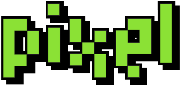
After deciding on the Geek character I then needed a name for the channel that portrayed animation but also something that seemed snappy and to the point. Many names crept up such as Motion, Crunch, Toast, Blank, Etc. and Point but all seemed to have little relevance to the topic of animation. I eventually decided on the title of PIXEL. Its a short title that relates to digital media, and digital products are at the heart of an animators career. Pixels make up the very movies we create and ONLY GEEKS would talk about something like PIXELS!
I then started to work on some rough logo ideas. I thought about pixel art and how this trend of illustration could be used in accordance with my own ideas. Retro games also cropped up as a relevant area to the title of PIXEL. Here are some initial ideas for my logo I had.

To start off with I looked at some fonts for inspiration about the style of the logo and these were some of the ones I took a liking to.

I then developed a text style which I was immediately pleased with. The boldness of the lettering seemed to work very well and I liked the impact and shape it had.

Here I started to develop the style more. I preferred the contrast of the black and white here and using different colours in the illustration gives it diversity in the design. I also think the iconic Space Invader represents the pixel idea very well and it could be used on my characters t-shirt design or something similar to continue the brand identity.

Here are the opposites of the black and white and this works really well as the black makes the text more powerful on the design. Also the outline wraps it all quite nicely but might not necessarily be needed later on.

Here I have tried applying outlines to the illustrations to see if this draws it out any more but I think this is a little too much and the bold block shapes alone function better.

This is an example of how the logos might look in black and white for printing on Off-Air material. This is important for the branding that the logo functions as a plain black and white image.


Finally I have experimented with the logo design as a BUG as it would appear in the corner of the screen on TV.

No comments:
Post a Comment